 Paul Klee
For the next four weeks on Sundays we will present the Zentrum Paul Klee collection. Enjoy :) I hope today's description is not too long!
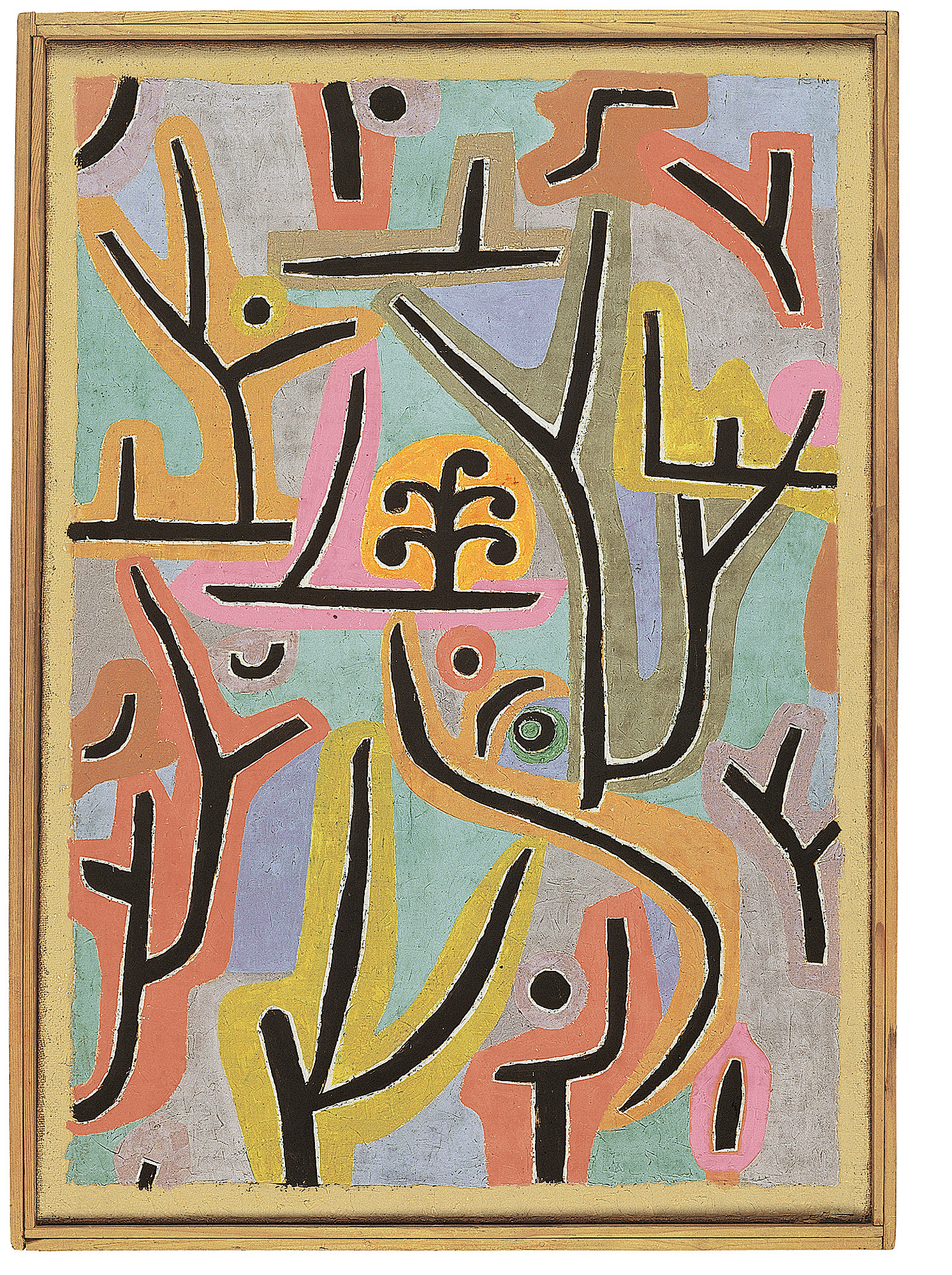
The picture Park near Lu comes alive due to a strong contrast between the black symbols showing the trees, branches and paths of a park, and then the surrounding colour zones like colourful foliage. It seems that a specific landscape inspired Paul Klee to paint this picture. Klee's wife Lily travelled several times in the late 1930's to Lucerne for health reasons where she spent time in a sanatorium. Paul Klee had visited her there, when his own physical condition permitted, and strolled with her through the park around the sanatorium.
In the picture two different colour tones are combined: a palette of warm green and brown shades, which culminate in a strong bright orange, and a more discreet selection with white and grey mixtures of green, grey and above all blue shades. There is even a red which is much cooler due to be mixed with white. The combination of the warmer colours on the one hand and the cooler on the other makes the differing spatial effects clear. While the warm colour tones seem to come to the fore, the cooler colours draw back and appear as though covered with a veil and further away.
Also, in nature, objects which are further away always appear brighter and bluer than those nearby. In their combination, the spatial effects of both colour tones open a lively play of advancing and retreating colours which is strengthened by the difference between the individual tones and with it their movement forwards or backwards. The warm red and yellow tones create the shell, the colour coating around the black symbols for the flowers, bushes and paths. An exception is the lilac-grey areas which surround some of the single, smaller symbols. The white bordered black signs, surrounded by the warmer colours characterize everything which makes up a park.
At the same time the background areas between the symbols and their remaining colourful shells, are so simple and striking in their form, that they stand out as individual figures in themselves. The colours of these areas change as they are stronger in contrast to the neighbouring warm areas or joined together through a related brightness. In this way also the background gains a constantly changing, spatially mobile form, just as a park consists of bushes, trees and meadows as well as the paths in between. This interplay of warm and cold colours, which evoked such spatially different far distant plains, could have initially been recognised by Paul Klee during his time serving at Schleissheim.
According to this system, the camouflage colours of the aircraft and goods trains were necessary to prevent the enemy from easily detecting the exact position of an object, since this could no longer be spatially determined. That way certain colours blended into the colour of the surroundings and the overall optical form of the aircraft was lost. The white framed black trees, branches and paths are reminiscent of the Iron Crosses, which were painted thickly in black with white edging onto the wings of the aircraft, so as to awaken fear and terror in the enemy. Klee was actually engaged during his military service time in Schleissheim to paint letters and symbols onto the already camouflage covered aircraft.